高考默寫
| AI默寫 🐽 | 是為了訓練,看你服不服,從不從;有多服,有多從。
在網站頁腳,關於 Moxie 裡,對默寫的態度,我專門說過,不贅述。
從14、15、16班那屆高二起,已經在整理高考背誦的資料,網站那時也已經搭完,後來似乎還將網站語雀化過;但那個最初的默寫網站用了 Google sites,原始鏈接一直在這裡: 默寫1.0。
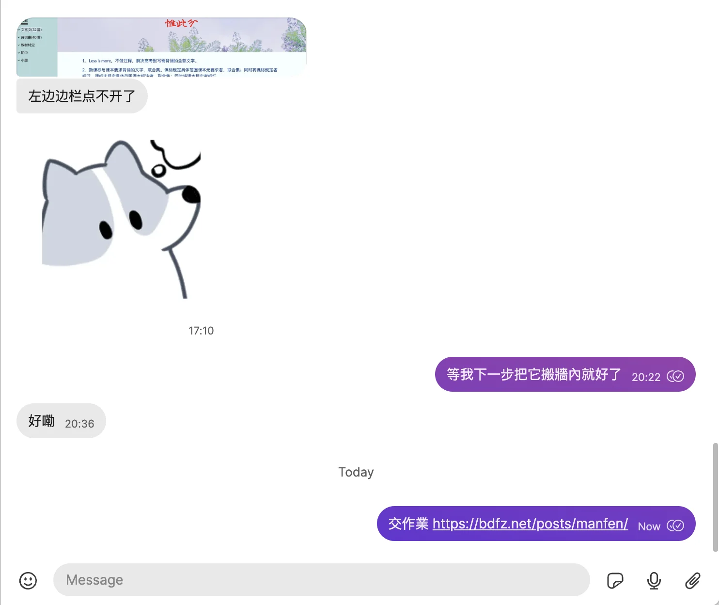
點開了打不開的,自己反思下為什麼不會翻牆。
沒錯,刻意選了個有牆的地方,當時;
現在想想,唉,就是有病⋯⋯
這幾天做完系列的| AI高考 🦁 | AI默寫 🐽 | AI論語 🐭 | AI紅樓 🐌 | AI課文🪲 | Bdfz-AI 🦩 | To-Do Online 🍄🟫 | ,突然發現,默寫題都牆內了,何苦還牆內牆外⋯⋯
於是,今天上午兩節課後,開始。
現在是18點,前後端完工,上線。
開始寫這個 About。
走了個彎路,昨晚。
當時想偷懶找個現成框架,試了下,css各種報錯⋯⋯
靜態網站再用框架,我就是🐶。
於是,從零寫起。
在代碼或自然語言這類事情上,最笨的方式,向來最無敵。
數據層面,用 Gemini 加幾個本地 py,整合出教材、課標和北京高考真題的 JSON。這一步其實最關鍵,畢竟,默寫是容不得錯一點的玩意兒。也因此,內容均簡體。
然後,架倉庫,搭前端。
為解決 CJK-Ext-E,不得不加入自定義字體,這會導致加載問題,但無解。教材用到 CJK-Ext-E,是教材的鍋嗎?當然不是,是文字學者的。怎麼就要類推簡化呢,實在比我還有病!
引入 gemini-2.0-flash-thinking-exp-01-21 作為後端,沒錯,背誦也加了 AI,偷了個名字:窺視者。
選中一段文字,在一段詭異神秘的指令下,AI 會全力幫你記住你勾選的句子。
1.0版網站的說明:
1、Less is more,不做注释,解决高考默写需背诵的全部文字。
2、新课标与课本要求背诵的文字,取合集。课标规定具体范围课本无要求者,取合集;同时将课标规定者标蓝。课标未规定具体范围课本标注者,取合集;同时将课本规定者标红。
3、文字以现行部编本教材为准,课标有但现行部编本无的文字以此前人教版教材为准。文本直接复制自2024年部编本官方教材,由GPT-4删除注释符号。
4、教材使用了两个CJK-Ext-C级汉字:“𫐓”、“𪭢”,一个CJK-Ext-E级类推简化字:“𬘢”,手机会显示乱码,点击計算機漢字處理,安装字库可解决电脑端显示问题。
4、网站自定义域名:https://mf.bdfzer.com。原网页使用书法字体,经SenBron建议改为宋体,致谢则个!
5、已标记北京历年默写真题,格式为,“加粗/黑底/黄字+命题年份”:小楼一夜听春雨,深巷明朝卖杏花。2023。因课本课标更新,有真题但已不在要求默写范围内,如《孔雀东南飞》2005年所考《孔雀东南飞》 。妾当作蒲苇,蒲苇纫如丝, 者,不再理会。
6、已标记全国卷默写真题,格式为:其称文小而其指极大,举类迩而见义远。
7、北京与全国(或非京)共同考过者,标记为:小楼一夜听春雨,深巷明朝卖杏花。2023/Q
8、2024年0501日发布1.0版本,20240707加入小学初中课标内要求背诵诗文并人工一校,文本直接复制自2024年部编本官方教材,由GPT-4o删除注释符号。
9、如见错讹,请邮件 admin 圈a i.pkuschool.edu.cn。网站有协作功能,有能力且有意愿维护本网站,可参与项目维护申请学分。
1.0還有一個:食用建議
1、建议讓GPT幫你制定默寫方案。要減負最穩妥的方案依舊是略過絕對不會考到的句子。真題可以幫你確立基準線:每篇內哪些可以被考到。叩此兩端,啟動!
2、不要發聲背誦,考試是動筆的,寫對才是一切。所以,準備默寫,不要背誦。
3、每一個字,一筆一畫,絕不連筆,做到任意OCR可以準確識別才能滿分。
4、真題情境設計都比較白痴,所以只要腦海有原文,不需要刻意關注。
5、默寫的8分,並不是在區隔誰可以985211,而衹是在分流走誰不可以。不是所有人都強於記誦默寫,日常乃至高考被扣分並不證明你是笨蛋。一切也許只是世界錯了,認下結果,做好自己。
8、不拿課堂時間時間搞默寫是因為6和7。默寫本質上衹是你的事情,而我並不能真的幫你做什麼。短時高壓所得並無價值。而你,需要做自己的選擇。
1.0版其實還有小學初中全部課標要求背誦內容,懶得搬了。
現在這一版說明:
并不欢迎你來
点击左右目录,你……可以开始背诵了;但你真正要的高考8分,是写出来的。所以,还是建议你,不在路上的话,笔墨伺候,边写边背。
本站包含高考课标和课本要求背诵全部内容,取合集。篇目文字以现行部编本教材为准,课标有但现行部编本无者,以此前人教版教材为准。
彩色背景的目录表示该篇目考过,你可以直接先试水做做那年真題。红色文字目录表示没考过;考过的会不会再考?当然会。
背得好不好?你可以去这里 高考默写 检测下。
网页右下角有窥视者,你可以咬ta,或者被ta咬。
网站迁移过来时有小概率出现正文问题,别骂,我……在校对了。你遇到的,辛苦论坛说下,或右键打开后面这个 反个馈
教材有 CJK-Ext-C 级汉字:“𫐓”、“𪭢”,一个CJK-Ext-E级类推简化字:“𬘢”,虽然我引入了 BabelStoneHan 字库,但你依旧有概率在手机被乱码或不显示,错……在国家文字规范那儿,你知道就好。
為什麼不歡迎?
默寫需要一個網站幫你嗎?可以不需要的。
如果需要,那幾乎就說明,網站其實幫不了你啥了,已經。
但,世事嗎,多無常;
絕望都可以用來反抗的,遑論其餘。
所以,網址: | 高考默寫 🦉 |
沒錯,這個 mf.bdfz.net 網址其實前段時間給過 1.0 版了。
現在,舊版死去,新版取奪。
mf 是什麼意思?
學生課上說,沒分的縮寫⋯⋯
我說,好的,然後,立刻,馬上,麻溜的⋯⋯給本文專門多加個標籤。
這個網站前後端都眉清目秀,後期把幾個不顯示的字加上,大概率不會再更新什麼。
但如果有,都會在本文下。
一個莫名其妙的安卓不顯示目錄坑,記錄:
Tutorial: Debugging the Disappearing Mobile Menu Toggle
It’s a common and frustrating scenario in responsive web development: your mobile navigation toggle button (the “hamburger” icon ☰) works perfectly on your iPhone or desktop simulator, but stubbornly refuses to appear on certain Android devices or other browsers. You’ve checked your media queries, the display: block seems right, yet the button remains invisible.
This tutorial explains the likely culprits behind this issue, drawing lessons from a real-world debugging case, and provides a systematic approach to fix it.
The Problem We Solved:
A mobile menu toggle button (#mobile-menu-toggle) was intended to appear on screens 800px wide or less. It worked on iOS but not on Android. The final fix involved correcting how its display and positioning styles were applied across different CSS rules (global vs. media queries).
Understanding the Culprits: Why CSS Can Be Tricky
Several core CSS concepts often interact to cause these kinds of cross-browser inconsistencies:
- The Cascade: Styles are applied in order. Rules defined later in the stylesheet or in more specific selectors can override earlier or less specific ones.
- Specificity: More specific selectors (e.g.,
header #mobile-menu-toggle) have more weight than less specific ones (e.g.,#mobile-menu-toggle). IDs have more weight than classes, which have more weight than element selectors.!importantoverrides almost everything (use with extreme caution!). - Media Queries: Styles within a media query (e.g.,
@media (max-width: 800px)) only apply when the condition is met. However, they still interact with global styles and other media queries based on cascade and specificity. - Global vs. Scoped Styles (The Key Lesson Here): It’s crucial how you structure your default (global) styles versus the styles applied only within specific media queries. Defining positioning (
position,top,left, etc.) globally for an element that is initially hidden (display: none;) can sometimes lead to unpredictable behavior when a media query later tries to make it visible (display: block;) without re-declaring all necessary positioning rules within that same query. The browser might get confused about which positioning context applies. - Browser Rendering Differences: While standards compliance is much better now, minor differences still exist in how browser engines (WebKit for iOS/Safari, Blink for Chrome/Android Chrome, Gecko for Firefox) calculate layout, handle specificity edge cases, or render certain properties.
- Caching: Browsers (especially mobile ones) aggressively cache CSS. You might be looking at an old version of your stylesheet, even after deploying changes.
The Debugging Playbook: How to Find the Issue
When your mobile toggle is playing hide-and-seek:
- Check the Basics (HTML):
- Viewport Meta Tag: Ensure
<meta name="viewport" content="width=device-width, initial-scale=1.0">is correctly placed in your HTML<head>. This is fundamental for responsive design. - Element Exists: Double-check that the button element (
<button id="mobile-menu-toggle">☰</button>) actually exists in your HTML where you expect it.
- Viewport Meta Tag: Ensure
- Browser DevTools are Your Best Friend:
- Remote Debugging: Connect the problematic device (e.g., the Android phone) to your computer via USB and use Chrome DevTools (
chrome://inspect) or Safari Web Inspector to inspect the live page on the device. This is crucial. - Inspect the Element: Select the
#mobile-menu-toggleelement in the “Elements” panel. - Check Computed Styles: Go to the “Computed” panel. Filter for the
displayproperty.- What is its final value? Is it
block(orinline-block, etc.) as expected, or is itnone? - If
none: Expand thedisplayproperty to see the CSS cascade. DevTools will show you exactly which rule (file and line number) is setting it tononeand which rules were overridden. This usually points directly to the conflicting rule. - If
block(but still invisible): The issue is likely positioning, size, or overlap. Check these computed styles:position,top,left,right,bottom,width,height,z-index,opacity,visibility,transform. Is the element 0x0 pixels? Is it positioned off-screen? Is itsz-indexlower than the header background?
- What is its final value? Is it
- Check Layout: Look at the box model diagram. Does it have margin/padding pushing it away? Inspect the parent element (
<header>) – does it haveoverflow: hidden? How are its flex/grid properties (justify-content,align-items) affecting the space available for the absolutely positioned button?
- Remote Debugging: Connect the problematic device (e.g., the Android phone) to your computer via USB and use Chrome DevTools (
- Isolate with Extreme Styles (Temporary Test): Force the element to be visible within the problematic media query:
If you still can’t see it, the problem is likely deeper (Viewport, browser bug, parent clipping). If you can see it now, the issue is definitely a styling conflict or layout constraint you need to identify using DevTools. (Remember to remove these test styles afterwards!).css
@media (max-width: 800px) { /* Or your target breakpoint */ #mobile-menu-toggle { display: block !important; width: 100px !important; height: 100px !important; background-color: red !important; border: 5px solid lime !important; position: fixed !important; /* Force fixed to test positioning */ top: 50px !important; left: 50px !important; z-index: 9999 !important; opacity: 1 !important; visibility: visible !important; } } - Clear Cache Thoroughly: On the problematic device, go into browser settings -> Privacy/Site Settings -> Clear browsing data -> Select “Cached images and files” (and potentially “Cookies and site data” for a full reset) -> Clear data. Then fully close and reopen the browser.
The Solution & Best Practices (Based on Our Fix)
The most robust way to handle mobile toggle visibility and positioning is:
- Minimal Global Style: Define only the default hidden state and non-positional base styles globally:
css
/* Global Scope */ #mobile-menu-toggle { display: none; /* Default: Hidden */ /* Basic styles like background, border, color, cursor, padding, z-index */ background: none; border: none; font-size: 1.8em; color: var(--text-color); cursor: pointer; padding: 5px; line-height: 1; z-index: 1101; } - Combined Display & Positioning in Media Query: Apply both the
display: blockrule and all necessary positioning rules together within the specific media query where the button should become visible:css/* Inside the relevant media query, e.g., max-width: 800px */ @media (max-width: 800px) { #mobile-menu-toggle { display: block; /* Make it visible */ /* Add ALL required positioning styles here */ position: absolute; top: 50%; left: 10px; /* Or your desired position */ transform: translateY(-50%); /* Adjust font-size etc. if needed */ font-size: 1.6em; } /* Hide desktop nav */ .side-nav { display: none; } /* other mobile styles... */ } - Clean Intermediate Breakpoints: Ensure that media queries for intermediate sizes (like
@media (max-width: 1024px)in our case) do not contain conflictingdisplay: none;rules for the mobile toggle. Let it inherit the globaldisplay: none;until the specific breakpoint (max-width: 800px) is met.
Conclusion:
Debugging CSS across devices often boils down to understanding the cascade, specificity, and how media queries interact with global styles. By defining minimal default states globally and applying display and positioning changes together within the correct media query breakpoint, you create more robust and predictable responsive layouts. And never underestimate the power (and frustration) of browser caching – always clear it thoroughly when testing CSS changes!
2025-04-13
- 完成第一輪校對,修改半角標點為全角。
- 修復作者不居中代碼。
- 更新說明字句。
2025-06-18
- 更新說明字句:
中译中一下,这个世界上没有比本网站更权威的背诵资料了。
高考一直考“名言警句”,但什么是名言警句不好确认;但,什么不是还是比较容易确定的,譬如“于是六国之士,有甯越、徐尚、苏秦、杜赫之属为之谋“一类,你……为什么要背诵默写?
2025-06-21
已錄入2025北京真題。